Our most complex ecommerce website to date took this Essex journalling and organisation business from a never-ending bug-bodging beast to a rich, optimised, colourfully-creative titan.
This has to be our biggest transformation story ever.
Oops a Daisy first came to Studio Cotton for some help with an endless barrage of website errors courtesy of a dated 8 year-old theme that had been overloaded with complex features, additions, customisations, and fixes.
To put it rather bluntly, the old Oops a Daisy website needed to be put out of its misery.
Sometimes, a website just aggregates so many errors, shoehorns, and compromises that it's much more effective to burn it all down and start again, rather than try to repair and refresh the existing website.
So we set out to create a brand new home for Oops a Daisy that would reflect the playfulness, fun, and originality of their incredible stationery product catalogue with the performance of a truly exceptional, box-fresh website.
To make this website project even more challenging, we needed to preserve a database of over 700 active stationery subscribers.
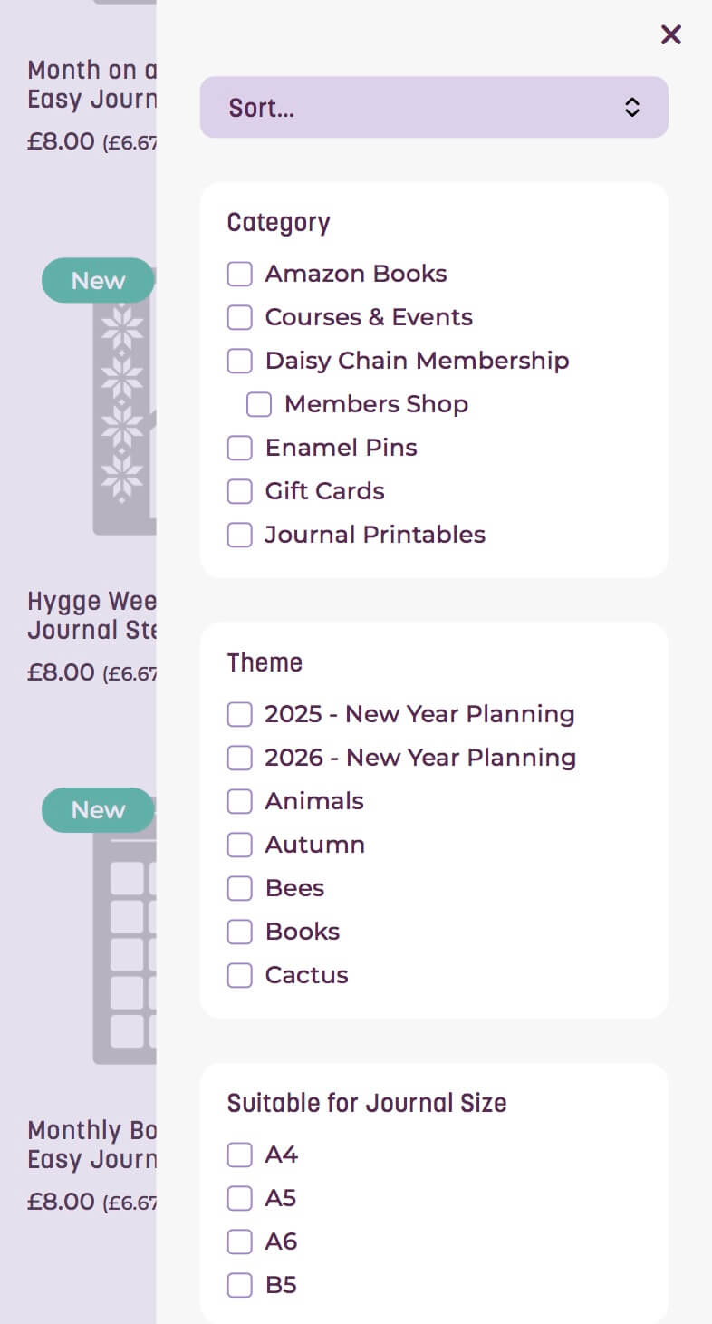
So we couldn't quite start from scratch - instead, we underwent the painstaking process of dismantling and rebuilding the website, piece-by-piece (well, page-by-page, template-by-template, and feature-by-feature) to preserve the original Woocommerce implementation.
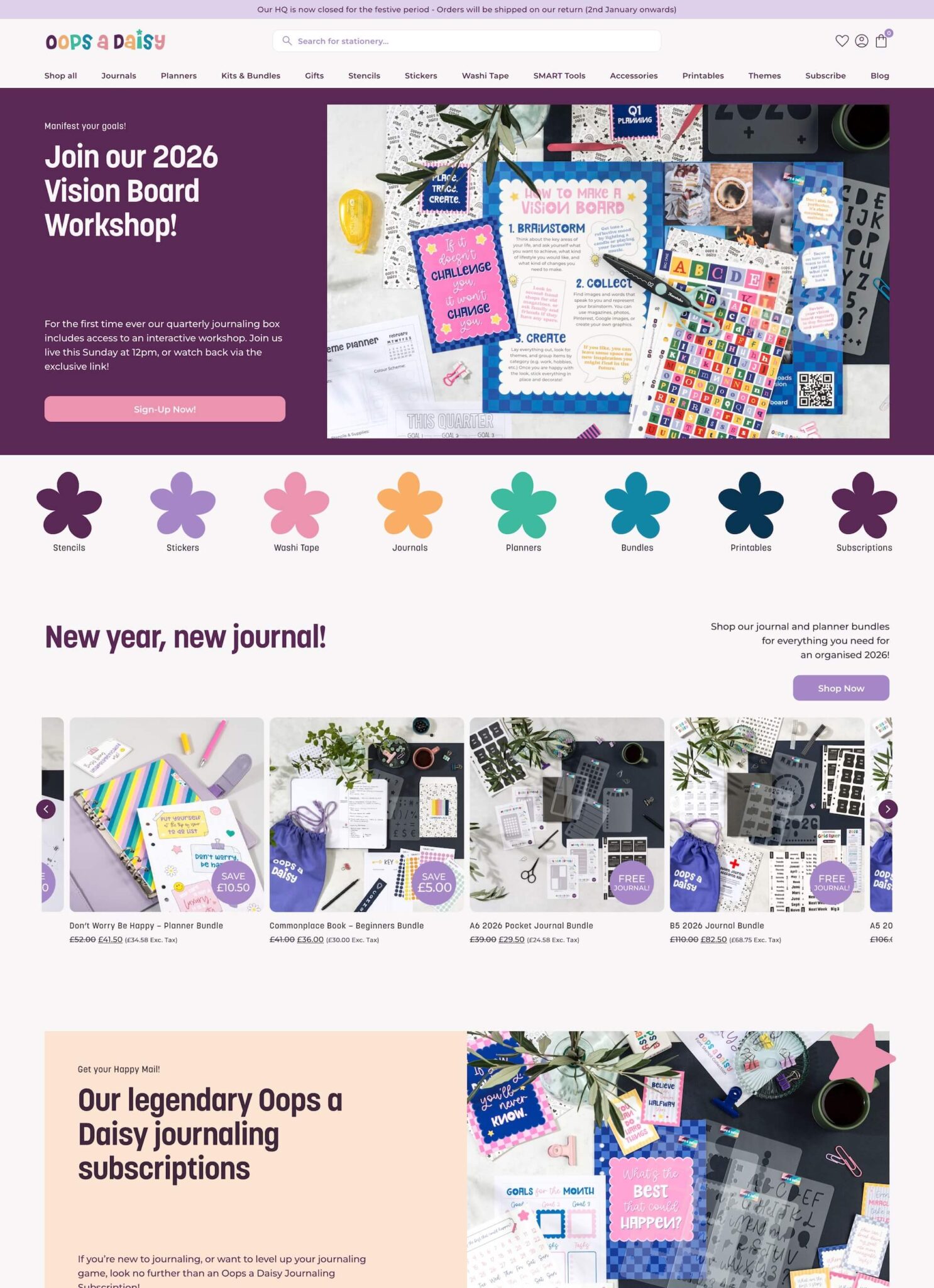
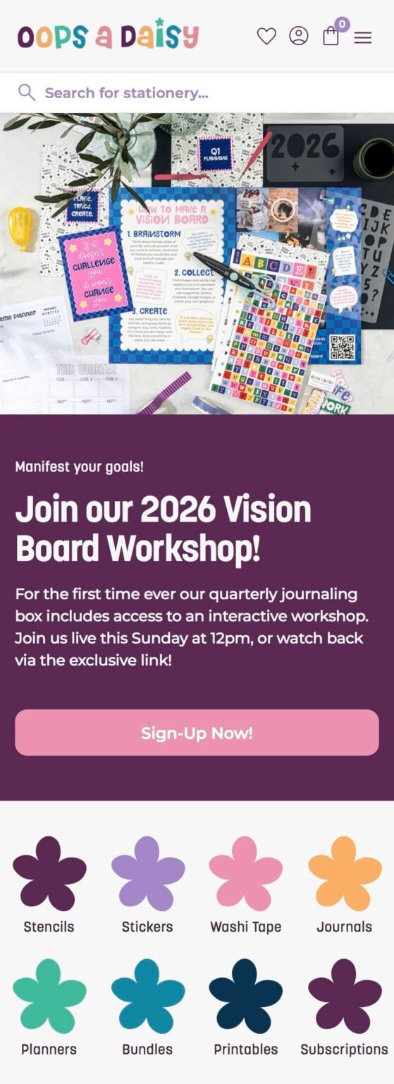
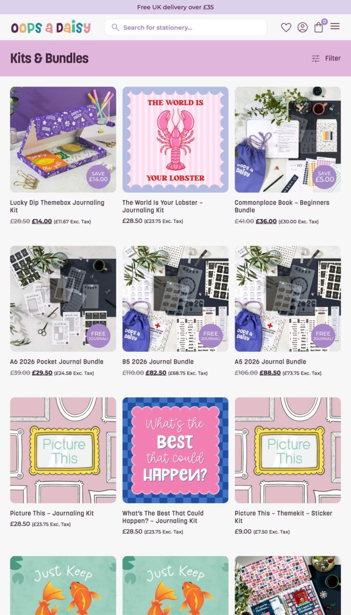
As a little treat, we started with the fun job - a major design overhaul that turned the website from just-about-functional into an explosion of colour, fun, and whimsy (our favourite).
In total, we applied this refreshed brand execution to over 90 pages and components - another gargantuan task!
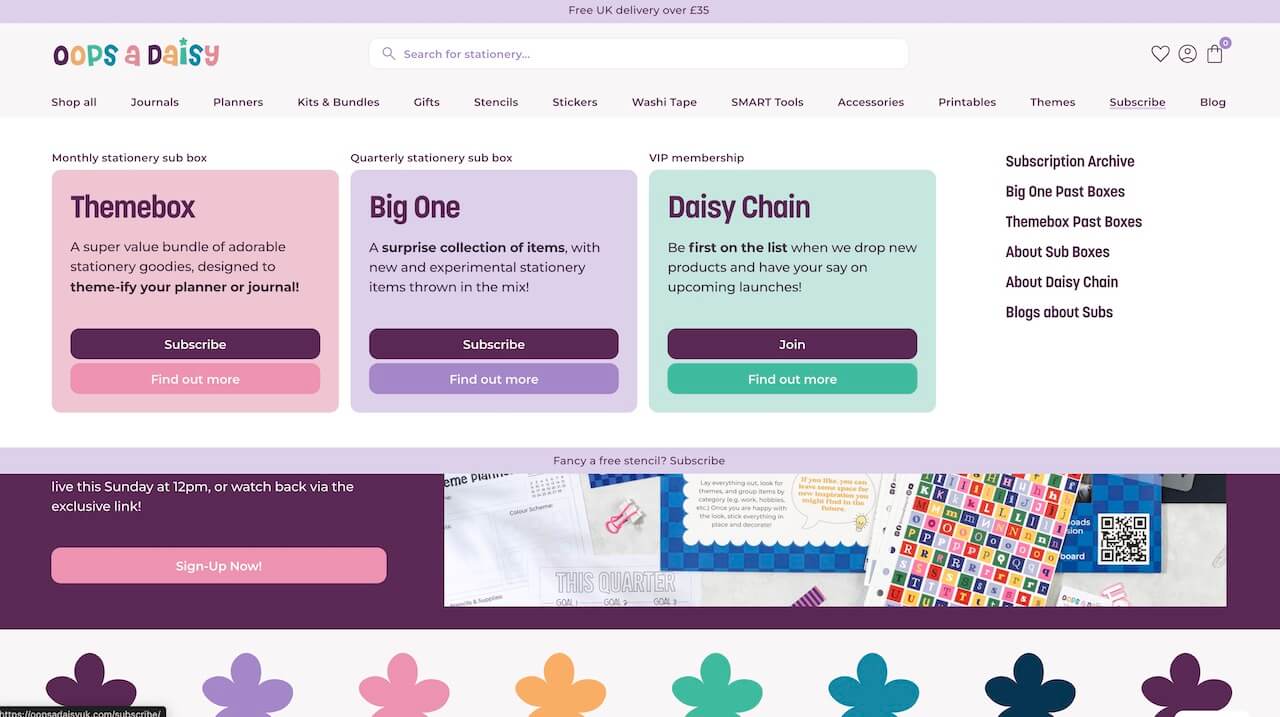
Then came the features - subscriptions, memberships, restricted content, wishlists, waitlists, gift cards, affiliates, custom order statuses, and oh-so much more.

We love to make online shopping more memorable, down to the smallest detail. Swapping out stars for on-brand daisies adds a little extra content engagement.

Our custom product modules allow Oops a Daisy to create rich content for their product pages, and show them on individual products or whole categories.
Which means a better experience for shoppers, more words for Google, and an optimised, time-minimised process for the small Oops a Daisy team.

We love a mega menu, especially when we get to flex a little extra creativity. This subscription mega menu helps sell the Themeboxes, Big Ones, and Daisy Chain experience before the first click.
As well as being an ambitious website design project, we also had an ambitious timeline - with a start in late October, we wanted to get the website live in time to impress the 2025 Christmas shoppers.
Well, we just about made it - going live within 60 days on the 18th of December. Whilst that might seem a little close to Santa's visits, the Oops a Daisy audience are big self-gifters, so there was plenty of time to work out any kinks and quirks whilst these stationery lovers treated themselves all betwixtmas long.
What's more, the site saw a totally unprecedented SEO spike immediately after launch, with clicks up 90%, and impressions up a whopping 135% (from 38k to over 90k) compared to the same period pre-launch.
We're already chatting about new features and additions to the website, and can't wait to keep working with Oops a Daisy on their wonderful, massive, small business website.
Get in touch with our independent Bristolian website design company for a cheerful & very websitey chat.
Our website uses cookies for analytics, styling, and functional purposes. By accepting cookies, you'll get the best version of our website - and we'll be able to process some of your data to make that happen.
A round up of helpful website expertise & articles, quick tips, studio scenes, projects, events, occasional freebies, and promotions for stuff we sell.
Written by Aime, delivered weekly. Weekly-ish.